Note
Go to the end to download the full example code
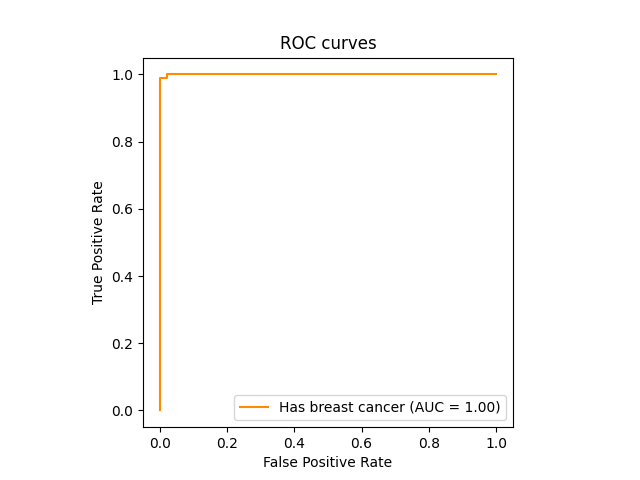
Plot the ROC curve
An example plot of the Receiver Operating Characteristic (ROC)
curve for SPPAM on the breast cancer dataset. We
want an area under the curve (AUC) that is near 1.
import matplotlib.pyplot as plt
from sklearn.datasets import load_breast_cancer
from sklearn.metrics import RocCurveDisplay
from sklearn.model_selection import train_test_split

from sppam import SPPAM

X, y = load_breast_cancer(return_X_y=True)
classifier = SPPAM()
X_train, X_test, y_train, y_test = train_test_split(X, y)
y_score = classifier.fit(X_train, y_train).predict_proba(X_test)

RocCurveDisplay.from_predictions(
    y_test,
    y_score[:, 1],
    name="Has breast cancer",
    color="darkorange"
)

plt.axis("square")
plt.xlabel("False Positive Rate")
plt.ylabel("True Positive Rate")
plt.title("ROC curves")
plt.legend()
plt.show()
Total running time of the script: ( 0 minutes 0.874 seconds)